Raederle (![[personal profile]](https://www.dreamwidth.org/img/silk/identity/user.png) seleneheart) wrote in
seleneheart) wrote in ![[community profile]](https://www.dreamwidth.org/img/silk/identity/community.png) acme_graphics2012-09-03 07:21 am
acme_graphics2012-09-03 07:21 am
Through the Darkness - Art Post
Title: Through the Darkness
Author:
Challenge:
Huge thanks to
Wallpaper - anyone who pays much attention to my journal knows that I love, love, love vintage travel posters, so this was inspired by some of the ones advertising Hawaii. The title art in particular references that style. Click for full size.
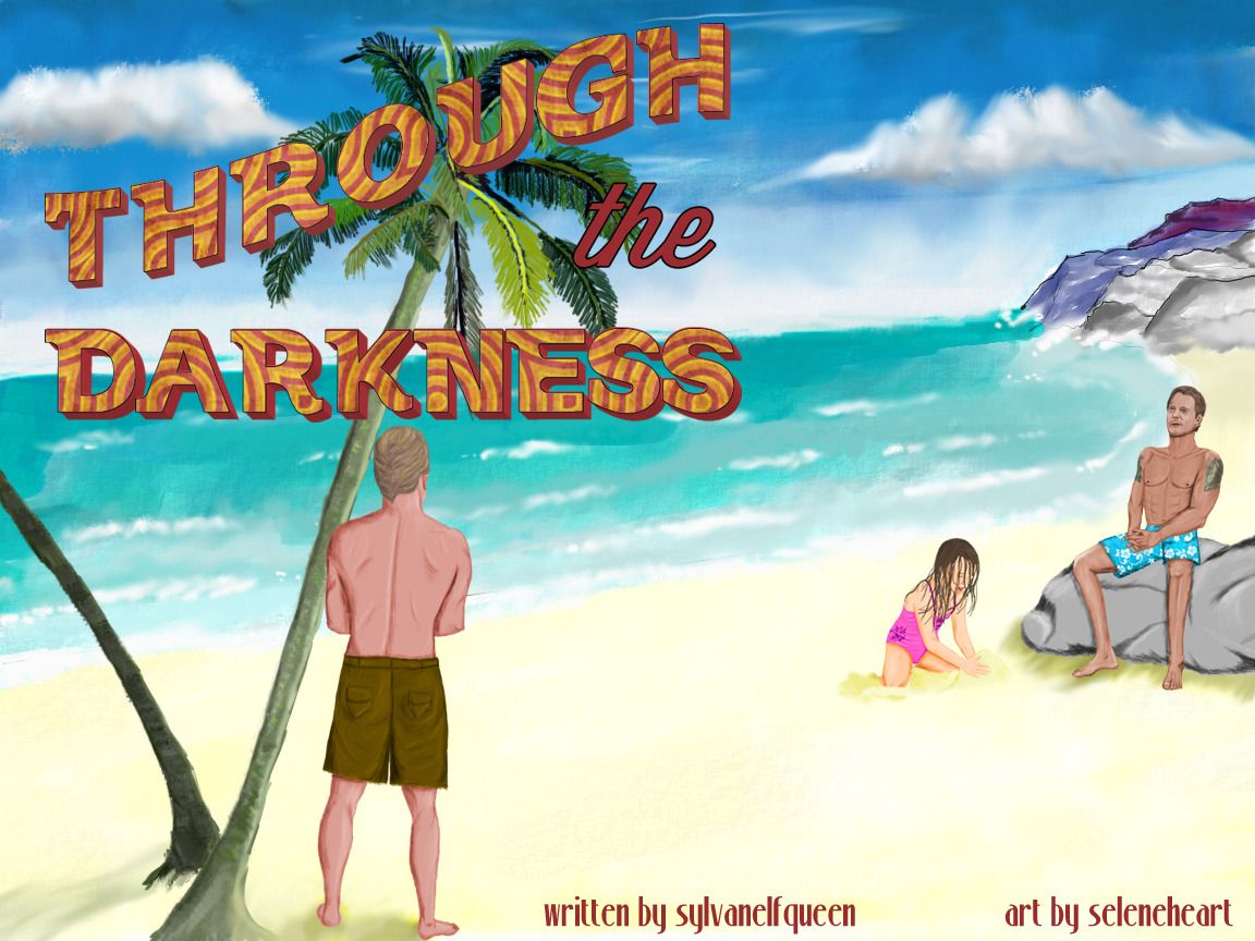
I was originally going to have Steve still in the wheelchair (see rough drafts below), but it ended up adding too much complication to the composition, so I put him on a rock instead.
Title Art

Grace's paintings -- These were an important part of the story and so I wanted to use them to illustrate it. I used my kids' art to get an idea how a child does things, and I asked my younger son to draw Super Steve so I could copy his style.


This one was meant to look worn and ragged from Steve carrying it around and unfolding it.


Steve's art -- There were slightly more sophisticated than Grace's work, but I still wanted a rough feel to them.


I couldn't resist animating this to indicate the two sides of the paper.

Steve - he was so hard to do, because I wanted his legs sort of frail, but his arms still bulky. Alex O is about the reverse of that.

Danny - sponsored by Scott Caan's extremely broad back.

Grace - I have a really hard time with Teilor Grubbs' skin tone, so I'm not completely happy with this.

Soundtrack front and back - the front carries forward with the title art, and the background for the back is the beach from the wallpaper, but I wanted something more 'graphics' looking instead of painted, hence the switch in style.


Icons and divider:

Scraps:
I really like making patterns when I'm doing fabric, because the pattern function in Photoshop gives so much control over how it will look. So this is the pattern for Steve's board shorts. And also this is the design for Grace's bathing suit, although it is not in a pattern.


For fun - when I made my claim for this Big Bang, I was on vacation and had only my sketchbook and iPad with me. I was excited about the story and wanted to get my idea for the wallpaper down while it was still in my head. So this is my original sketch (I have no idea why my cell phone makes things pink), and the second one is fingerpainting on my iPad with one of the drawing apps that had very limited coloring choices.


Tools: Corel Painter, Bamboo Tablet, Illustrator, Photoshop, Paper 53 app
Fonts: Vintage, Wisdom Script, StonyIsland, Automobile
Inspirations, References, and Sources
http://vector.tutsplus.com/tutorials/designing/vintage-type-postcard/
http://www.universaldesignstyle.com/mobi-electric-folding-wheelchair-concept/
http://www.keepdesigning.com/illustrator/hawaii-floral-wallpaper-vector-free/#more-233
http://myphotoshopbrushes.com/patterns/id/1049/
http://blog.templatemonster.com/2011/11/03/free-grunge-photoshop-patterns/
http://webtreatsetc.deviantart.com/art/Grungy-Summer-Patterns-132995249
http://www.critterzone.com/animal-pictures-nature/stock-photos
http://www.mycoven.de/hawaii-five-0-screencaps-season-2/
http://masterfile.com